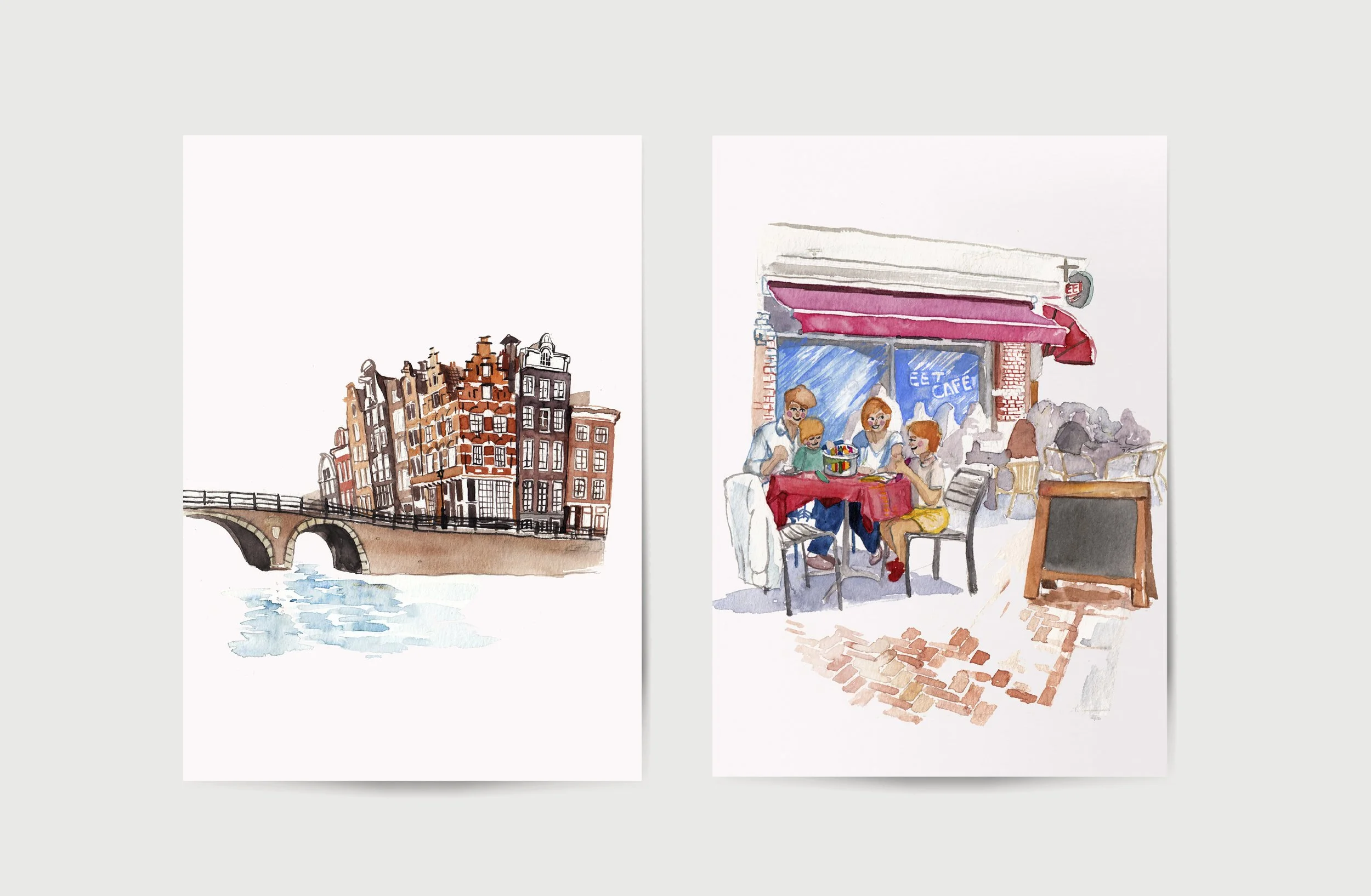
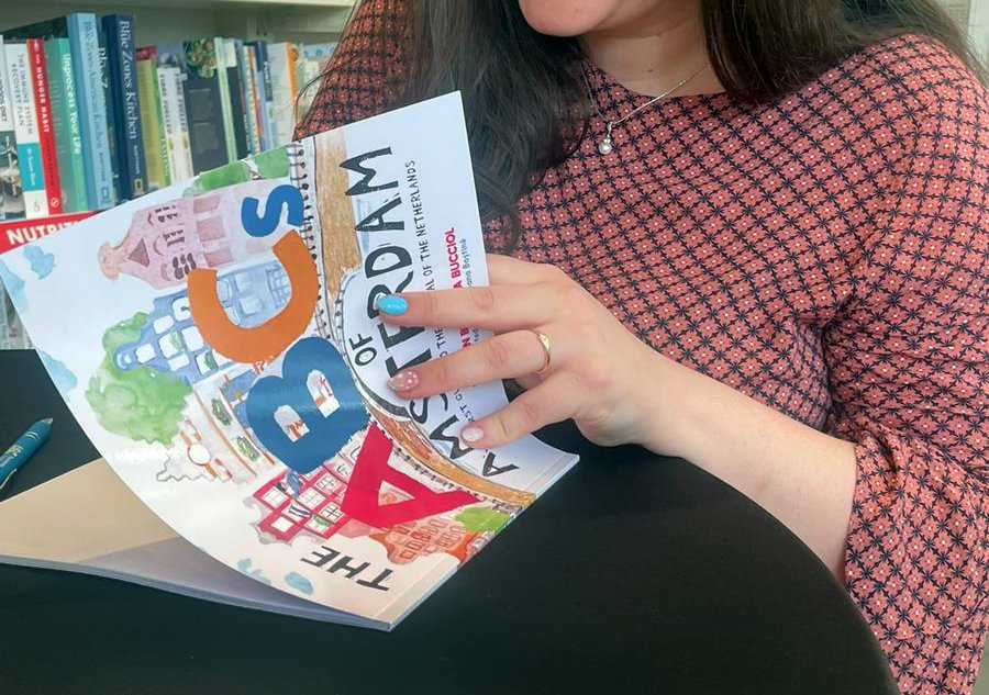
ABCs of Amsterdam & ABCs of London
Illustrated Children’s Books by Paola Bucciol
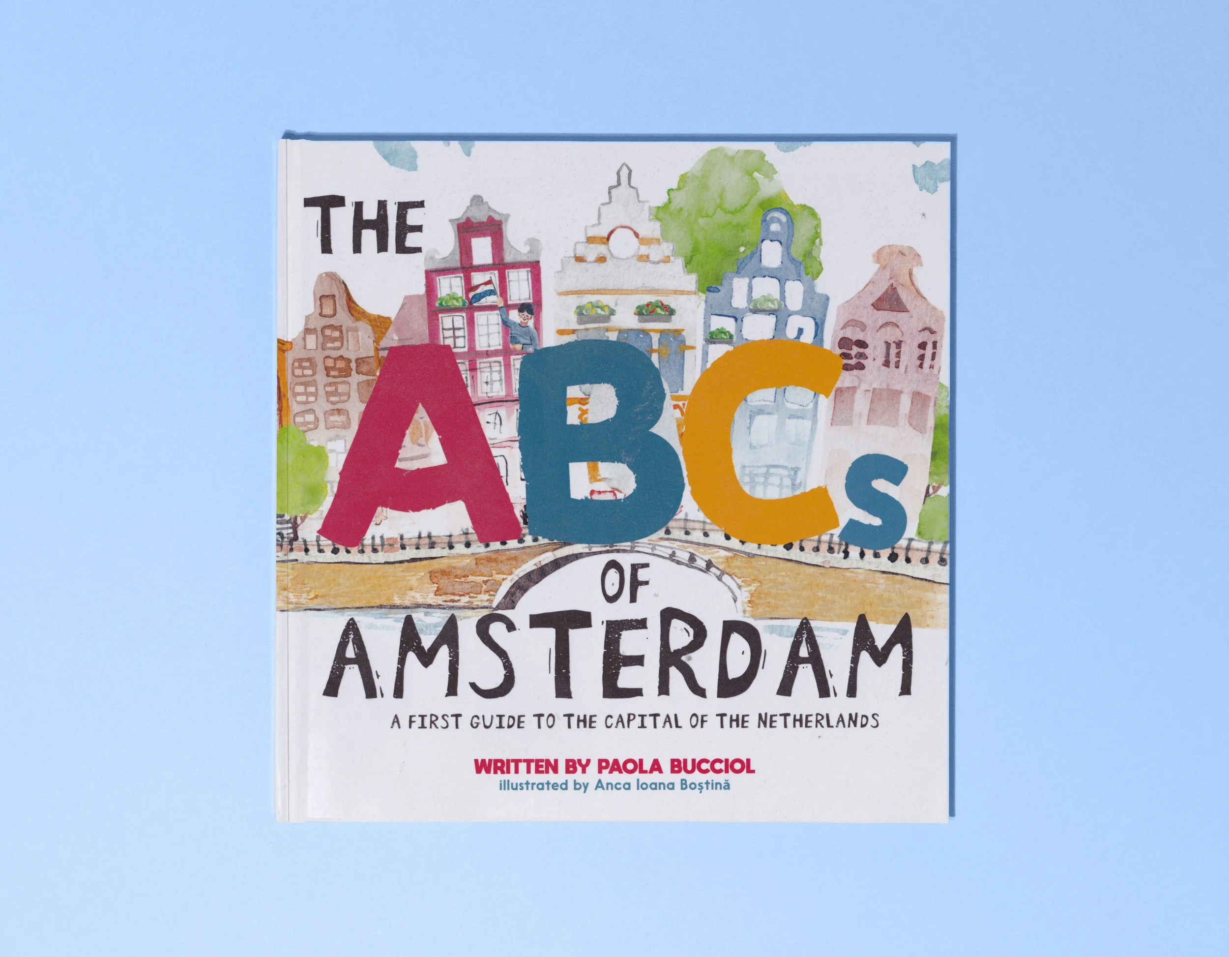
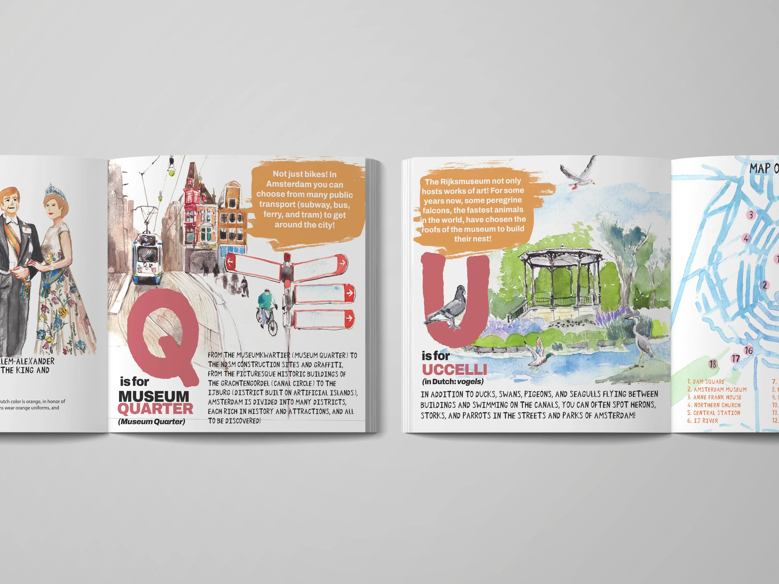
A wonderful companion book for young readers exploring the city of Amsterdam for the first time. Each letter guides you to a place of cultural or historical significance. It's a great item to carry for your next visit to Amsterdam and it comes with a handy map of all of the major museums found around the center of the city.
Following the success of the first book, we had also continued with a second title dedicated to the city of London.
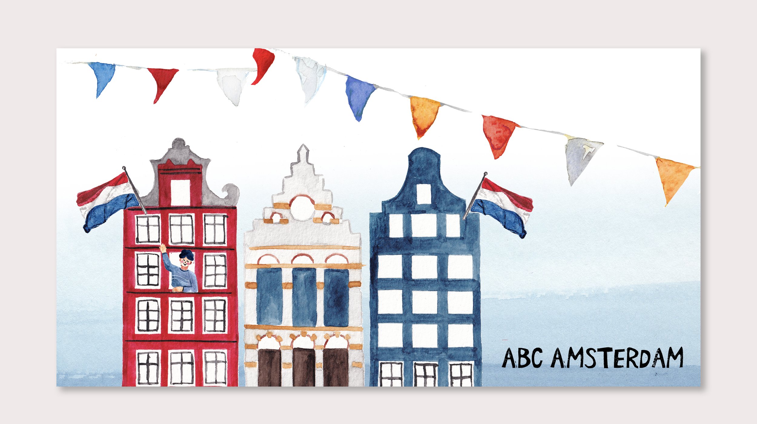
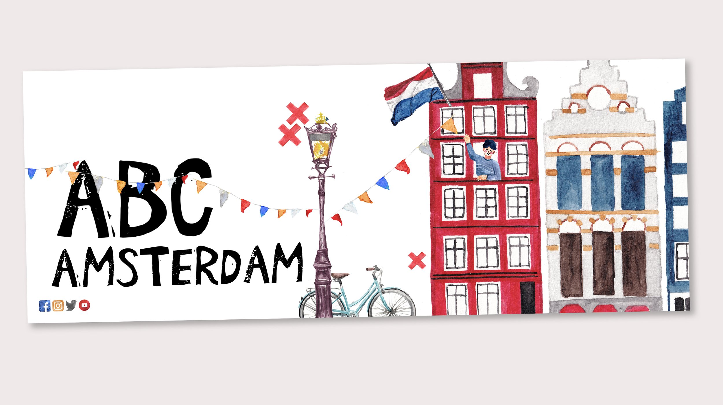
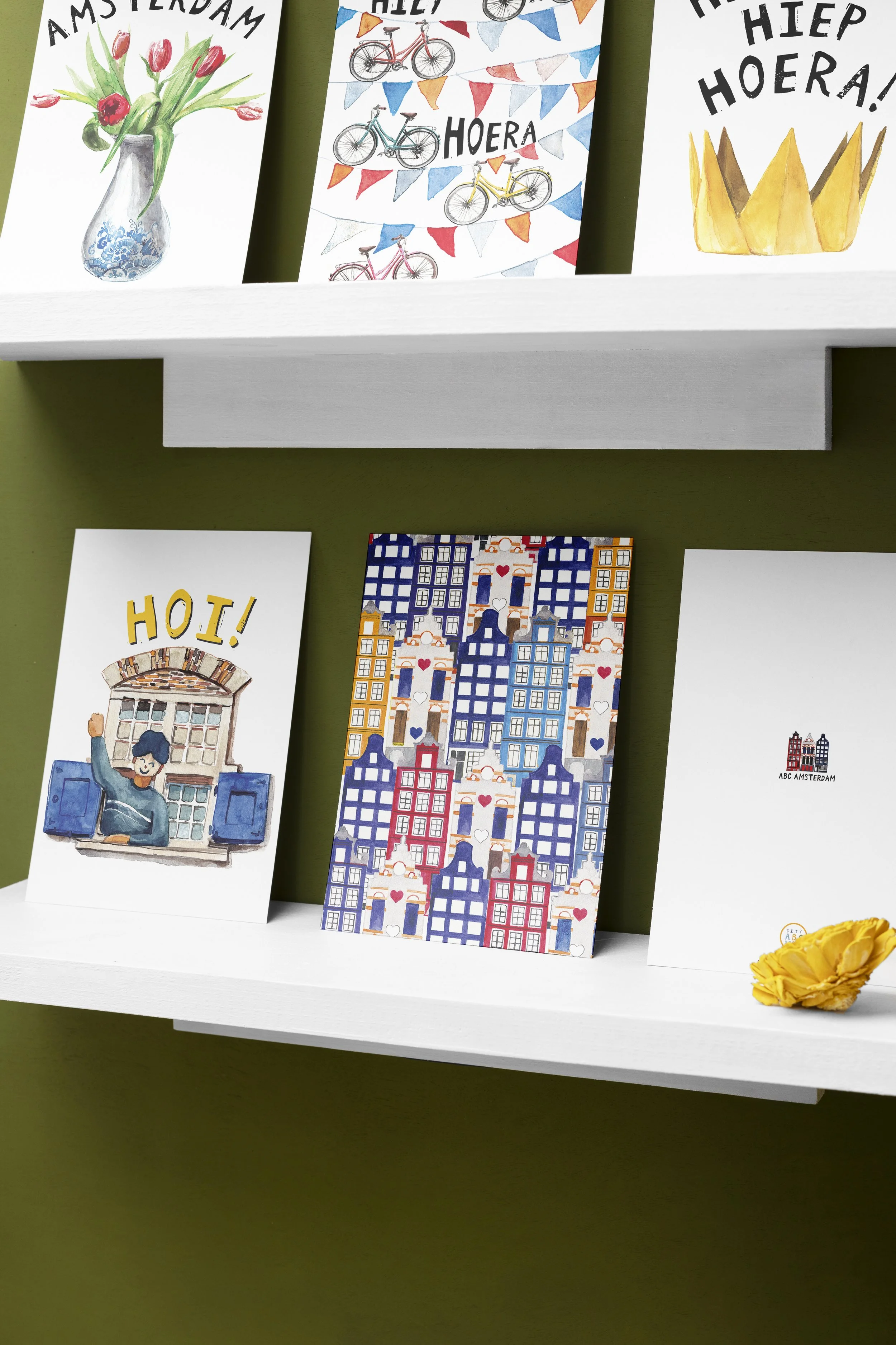
In 2021, City Abc Books, who offers illustrated guidebooks for young travelers, contacted me in regards to creating a visual identity for their brand that was in line with the hand painted, colorful and joyful vision of their first products. The challenge was to employ traditional painting techniques and a sense of handmade craft to express the spirit of Amsterdam, where their headquarters are.
Illustrator & Brand Designer
2021 & 2025
Adobe In design, Illustrator, Photoshop & Watercolor Paintings by me
Craft, Art and Joy
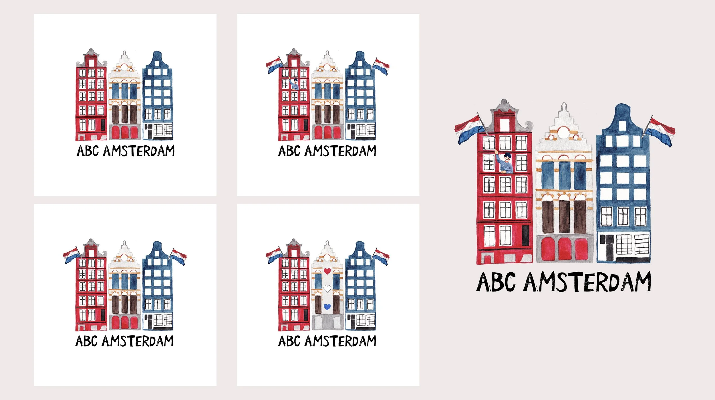
Initially, the brand had been called ABCs of Amsterdam. I have created an illustration that could be efficiently prepared for various printing processes, that could showcase the vibrancy of the dutch capital city through a very recognizable row of 3 townhouses.
My initial inspiration for the style direction was Miroslav Sasek. Something in his color palette, use of lineart and slight deformed angle of his buildings appealed to the lighthearted, playful idea we had begun with.
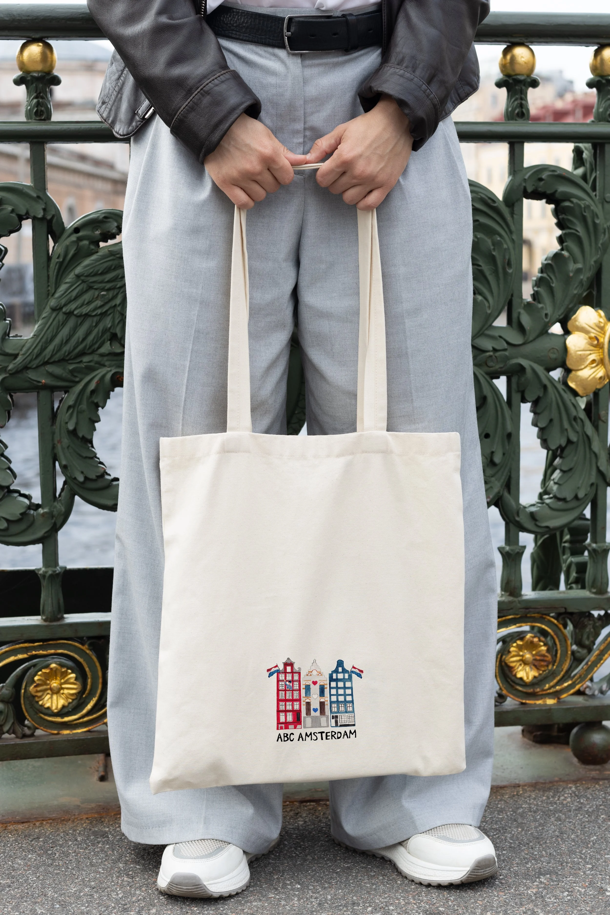
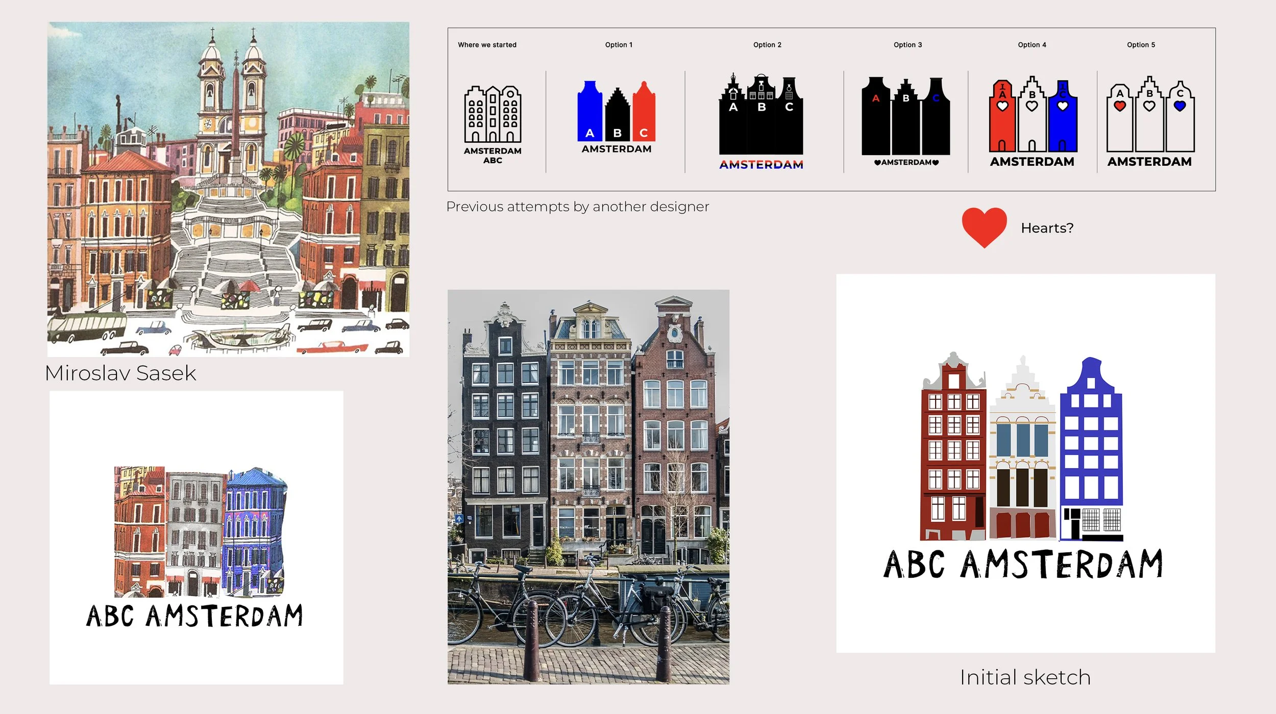
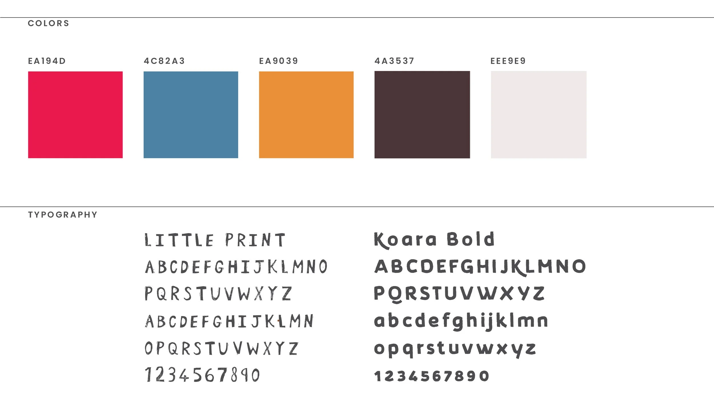
This is how the identity of City ABC Books came to be. Between the woodcut resembling imperfect ‘Little Print’ font, the slightly vintage take on the primary color triad and ‘Koara Bold’, something inherently more modern but still playful and bold enough for a children’s book.


ABCs of London
The second book in the series received an updated color scheme and a more detailed map of points of interests around London.
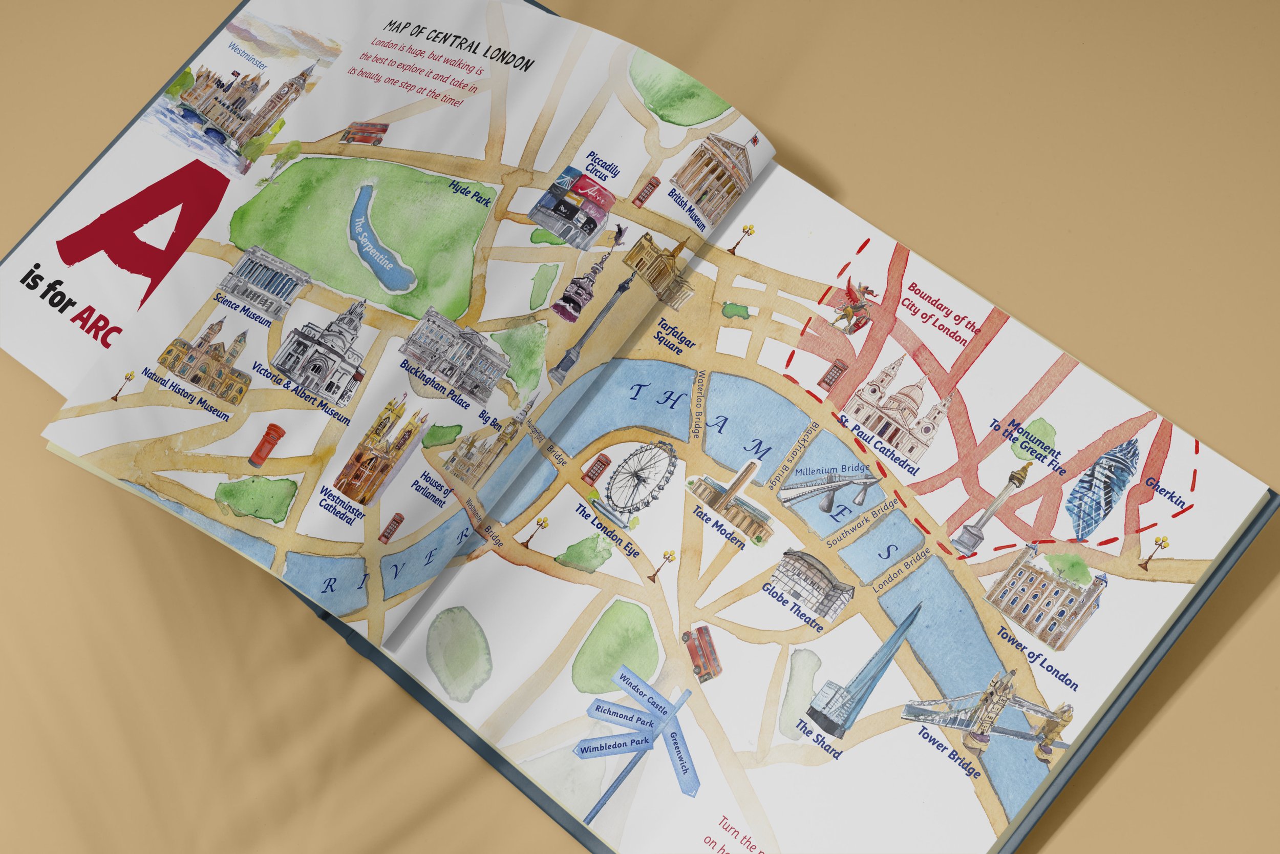
The Map of London
