
Building a Modern Brand for Soundservice
To celebrate Soundservice's 15th anniversary, I led a visual refresh of the company's established brand identity. The challenge was not to reinvent the brand, but to modernize it while preserving the trust and recognition it had built over 15 years and across 28 hearing centers.
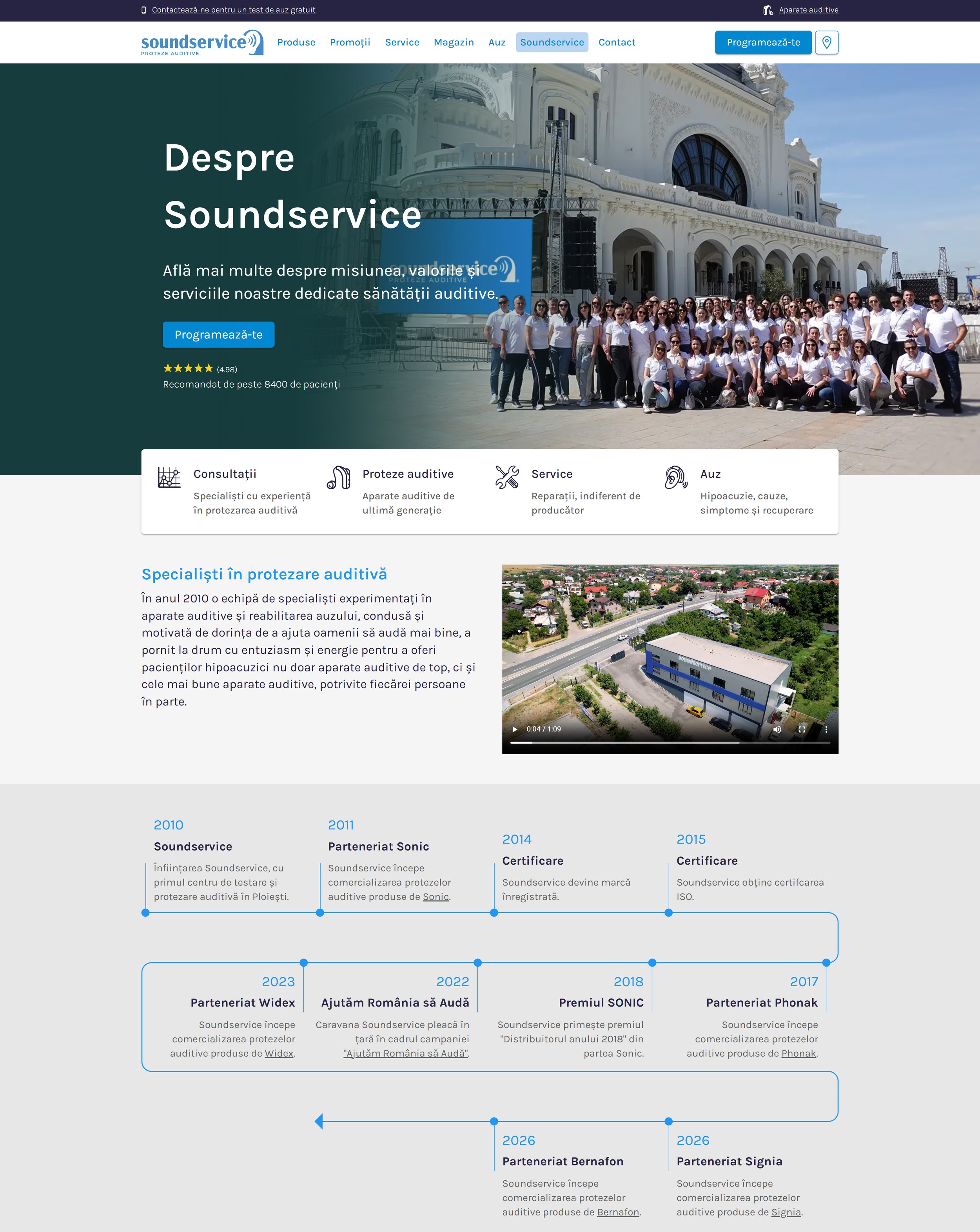
The refreshed identity was introduced alongside the launch of a redesigned website and updated marketing materials, creating a more cohesive visual language across digital and physical touchpoints.
Brand Designer, Graphic Designer
2025
Adobe Suite & Figma
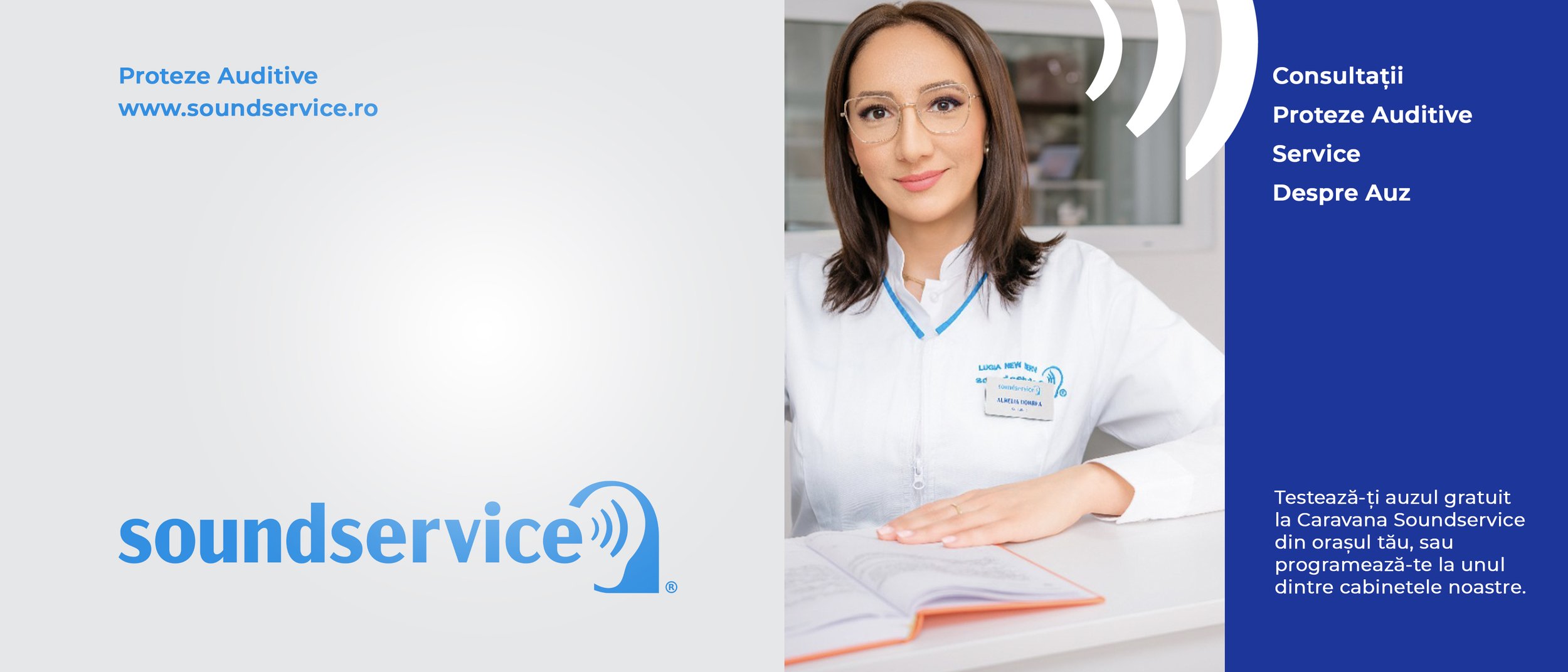
I was responsible for leading the visual refresh and creating a more flexible brand system that could be applied consistently across every customer touchpoint.
My responsibilities included:
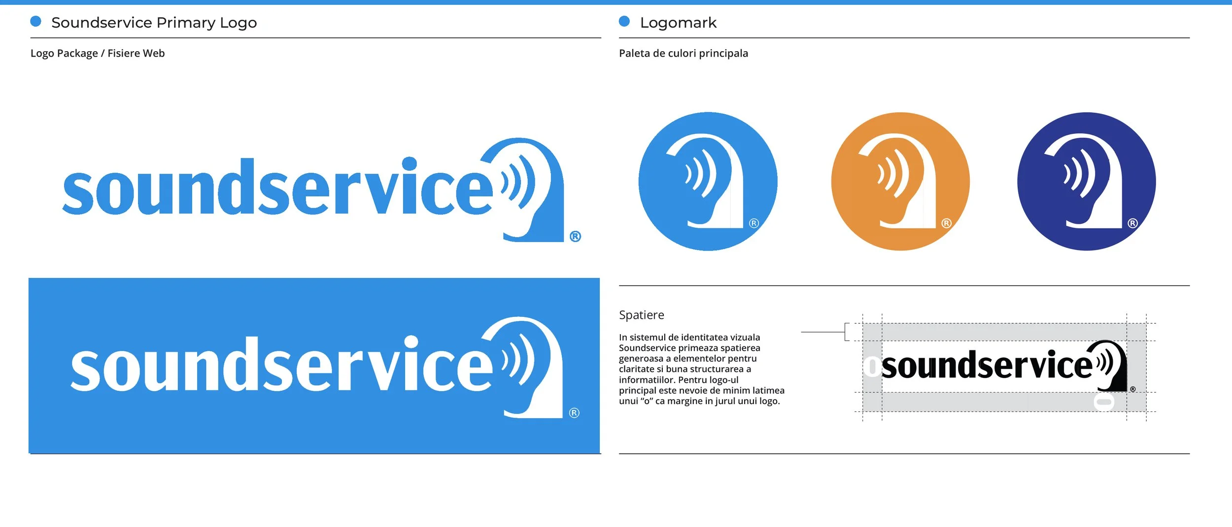
Redesigning the primary logo system
Creating the 15th Anniversary identity
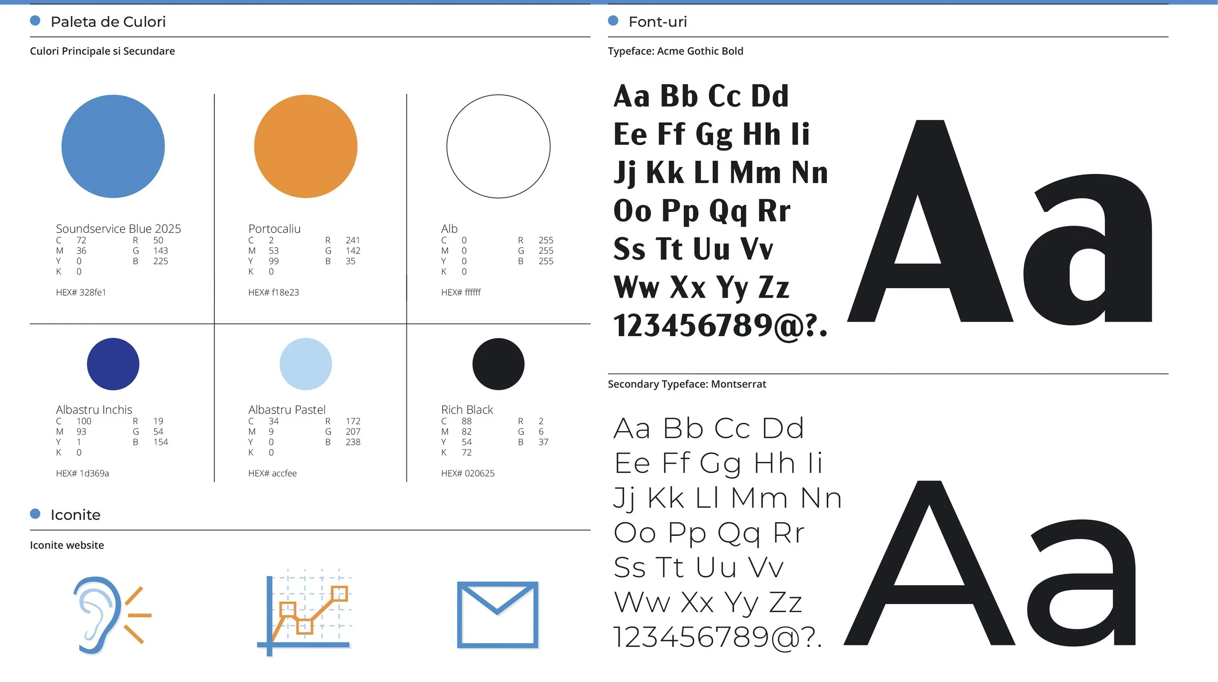
Updating typography and colour standards
Developing the brand guidelines
Producing website assets and digital graphics
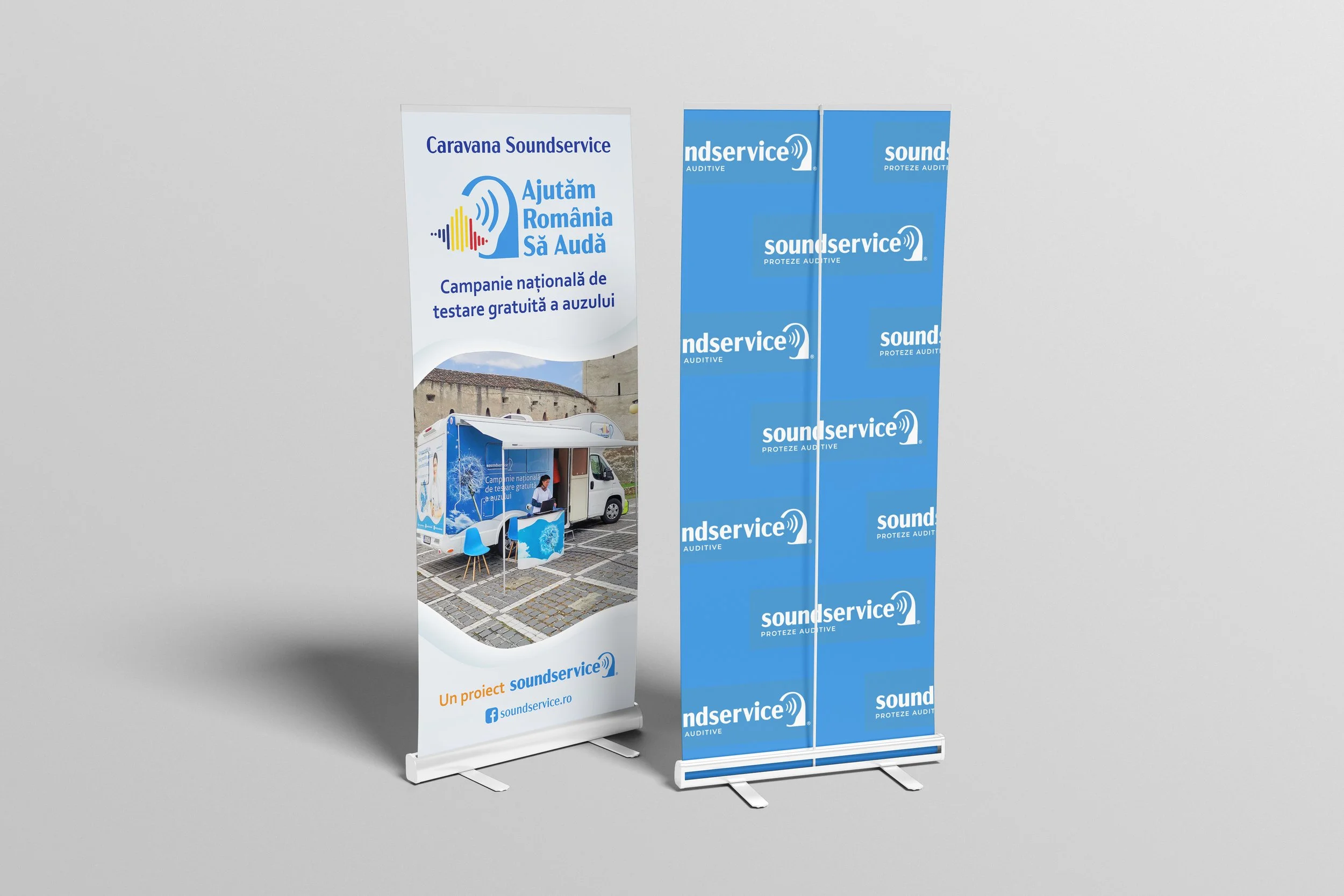
Designing social media and campaign materials
Supporting printed collateral and conference materials
Coordinating visual consistency with the external marketing agency
The Challenge
Soundservice had developed a strong presence in Romania's hearing healthcare market, but its visual identity no longer reflected the maturity of the business.
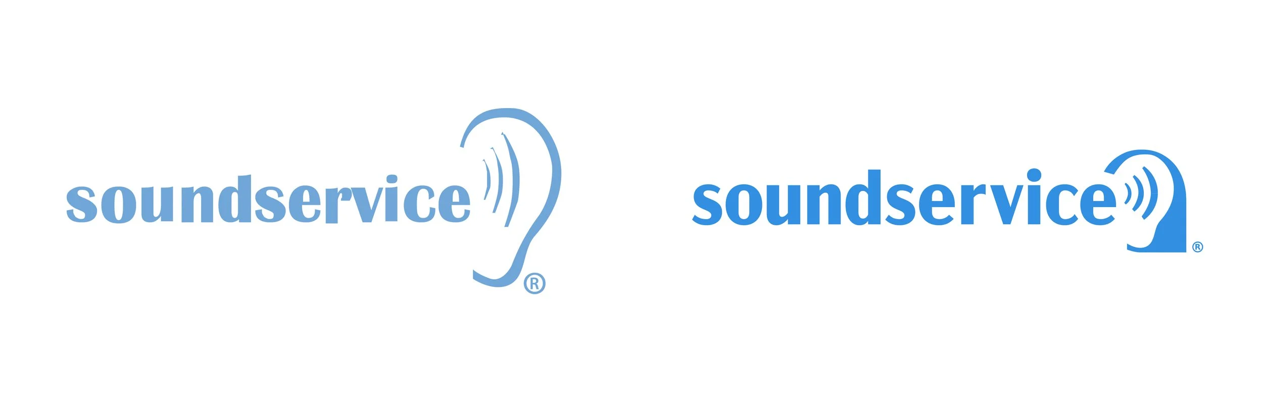
The existing logo presented several practical issues. At smaller sizes, the ear symbol lacked clarity, the typography suffered from inconsistent spacing and proportions, and the relationship between the symbol and wordmark felt unbalanced.
-
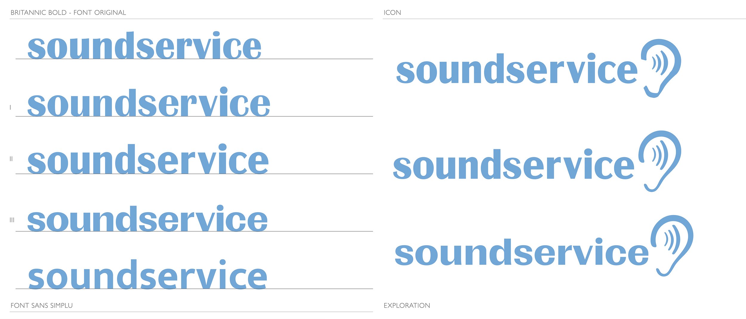
Typography Exploration
The typography became the starting point.
The original logo relied on Britannic Bold, a typeface with a distinctive personality but several characteristics that reduced readability at smaller sizes. I explored related type families that retained the warmth and familiarity of the original while offering improved proportions, spacing and scalability.
-
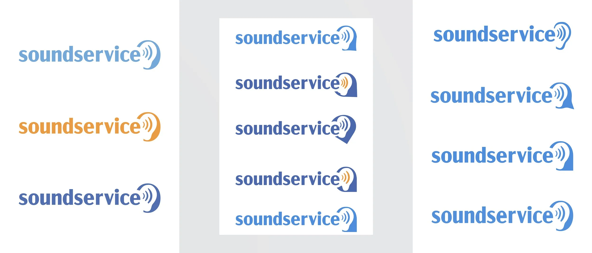
Logomark Variations
Once the new typographic direction was established, I rebuilt the logomark around the updated letterforms.
The ear icon remained intentionally familiar, ensuring that thousands of existing patients would immediately recognize the brand, while improving its visual balance and legibility across applications—from digital interfaces to signage.


Approach & Outcome
Rather than replacing the existing identity, I focused on strengthening what already worked.
The goal was to preserve the values the company had become known for: empathy, consistency, professionalism and accessibility. Also while creating a visual system that felt cleaner, more contemporary and easier to use.
The refreshed identity introduced a more coherent and flexible design system without losing the familiarity of the original brand.
The updated logo performs more reliably across different sizes and formats, while the revised typography and guidelines created greater consistency throughout the company's communication.
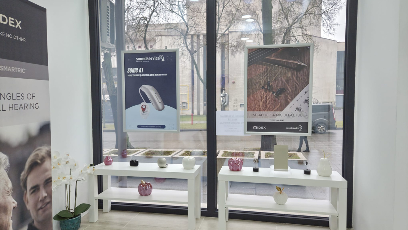
The project also established a stronger foundation for future marketing, supporting a unified visual language across the website, digital campaigns, social media, print materials and physical locations.
More importantly, it demonstrated how thoughtful evolution can strengthen an established brand without sacrificing recognition or trust.